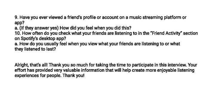
1. Research
This project was heavily based on research. As we wanted to develop a feature that people would love and use, we had to understand what was available on the market, what has been attempted, and what do users actually want. To do so, we have done some preliminary secondary research.
Research Goals
- 1. Understand the concept and the context of sharing
- 2. Understand user needs, goals & behavior on the music platform
- 3. Discover and understand people’s music sharing habits
- 4. Discover any barriers and pain points about music sharing
- 5. Determine ways to improve social engagement
The Problem
Originally created as a solution to digital media piracy in the early 2000s, Spotify has become the leading music streaming service in the world. Its mission is “to help people share to whatever music they want, whenever they want, wherever they want – in a completely legal and accessible way.”
Despite Spotify's global success, they know that they need to improve user engagement and retention, especially given the intersection of music and social connection between people. Past attempts at leveraging that need haven't been very successful – so, the question remains, what's missing?
Project Objectives:
Conduct research to identify opportunities for new features in Spotify's mobile app Prioritize and design the features that cater to target users' needs, while fulfilling business objectives Maintain consistency between new designs and Spotify's existing UI
Role
Lead UI/UX designer responsible for user research, strategy, UI design, prototyping, visual design, usability testing, and branding within a Lean UX framework.
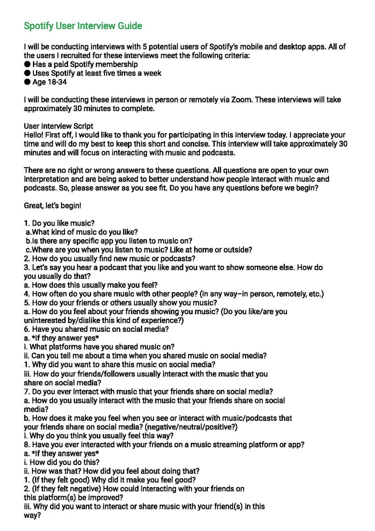
Analyzing Secondary Data
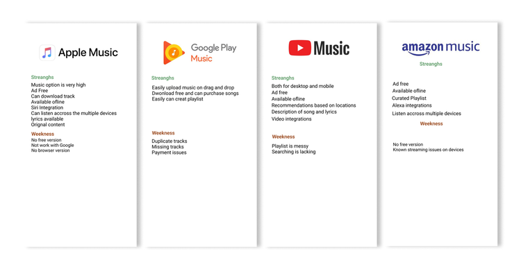
To begin, I conducted a rapid research session of secondary sources. I spent a few hours getting a sense of Spotify’s place within the landscape of streaming music providers and gathering enough information to help determine the focus and scope of my research. I identified some key challenges and opportunities and made a list of initial assumptions and questions. From there, I conducted a competitive analysis comparing competitors’ strengths and weaknesses, as well as identifying where opportunities for Spotify to differentiate itself with a social feature might exist.
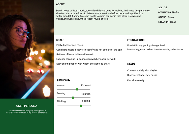
After doing all our research and interviews, we gathered all of our finding and transformed them into tools that would help us define our users. As such, we developed a persona and an empathy map to better understand our user and his journey.
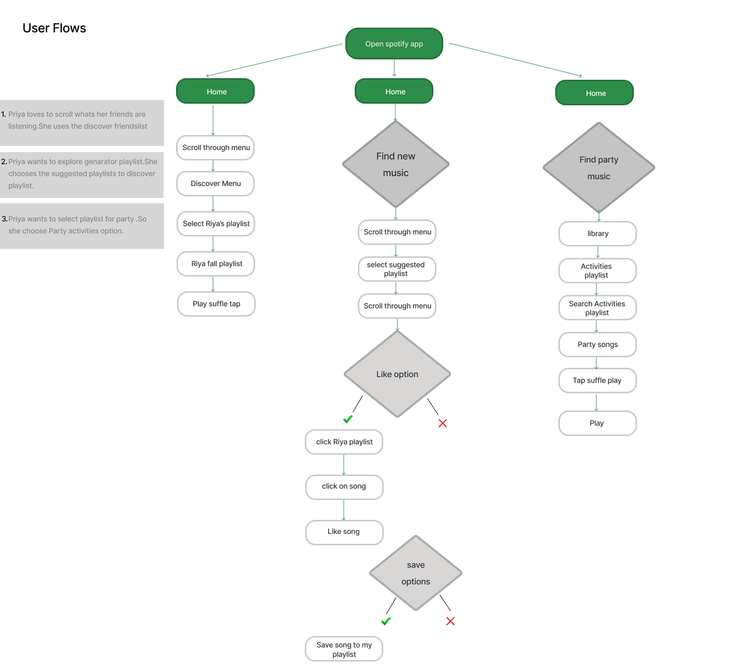
2. Interaction Design
From then, we had our goal and the idea of what we had to do.
The storyboard that we previously created helped us to develop our user flow.
User Flow
Connecting people with similar interest through events
Wireframe: Low Fidelity
Before going digital, I sketched out the key screens necessary for fulfilling the tasks. Sketching first allowed me to brainstorm different ideas for designing different screens effectively. Below is some final low fidelity I intend to use when moving into digital wireframing.
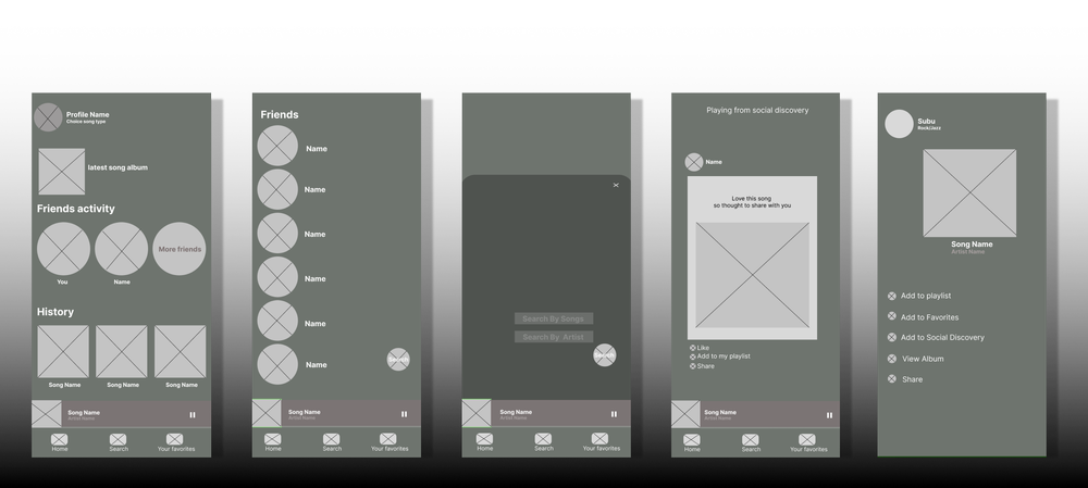
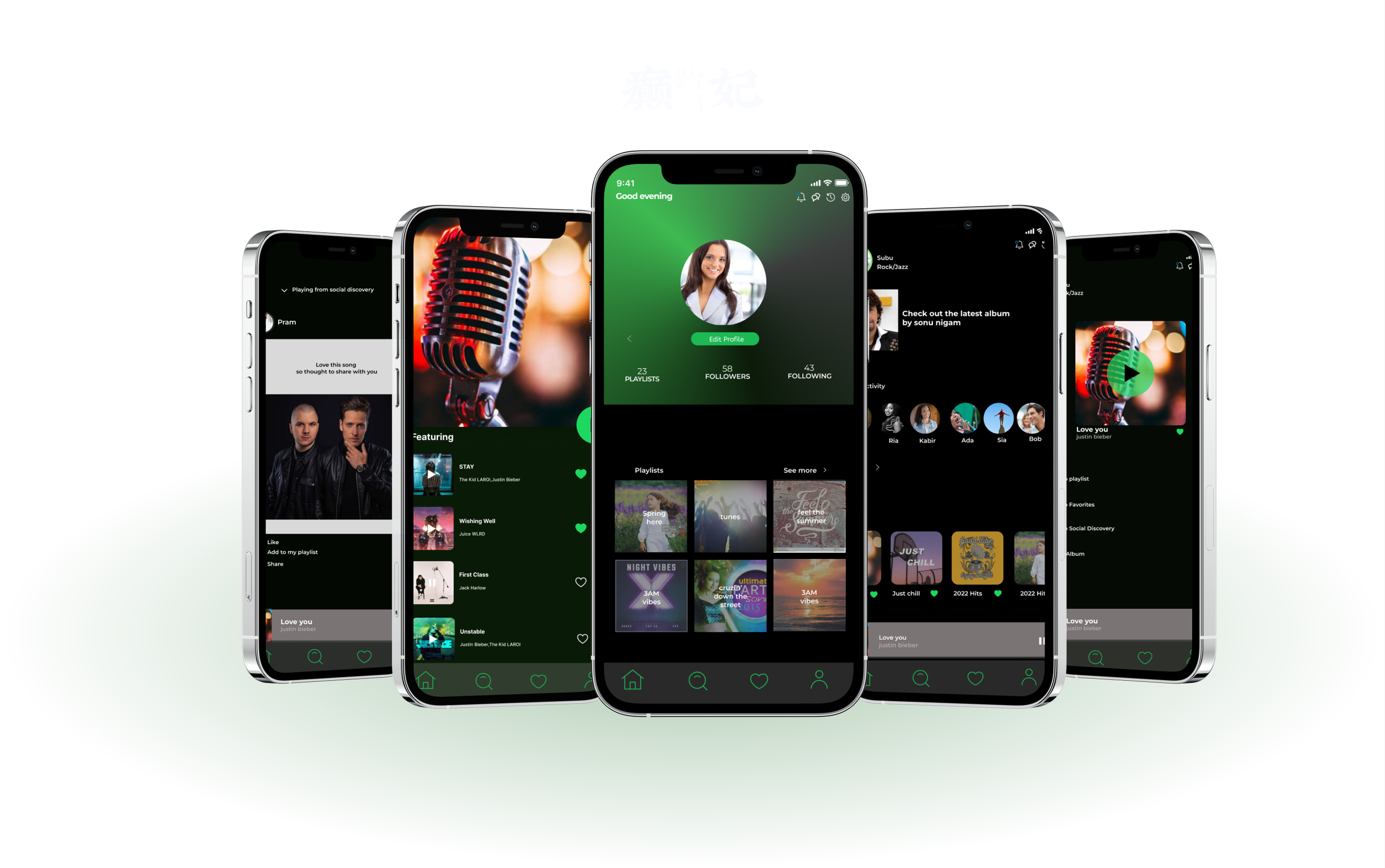
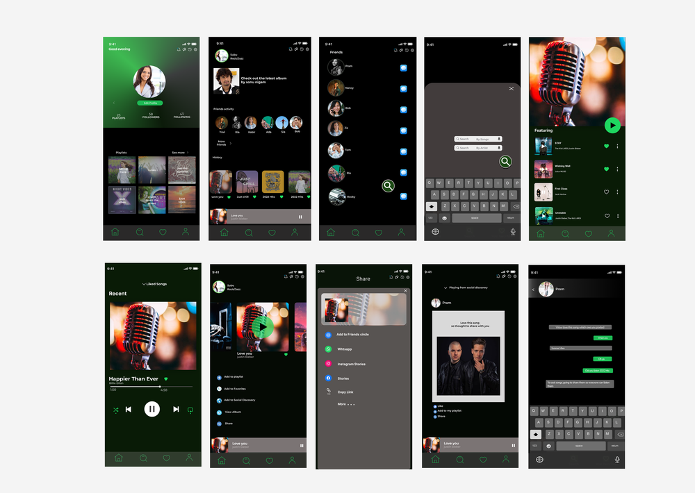
High Fidelity
Prior to sketching, I looked at the design patterns of Spotify's competitors to understand their UI patterns. I then looked at Spotify's design patterns to get a better sense of what elements must stay consistent in order for the new Spotify sharing feature to feel like part of the family then With the low-fidelity sketches completed, I began to design the pages
Close