The Soul Is A Charitable Organization
who is recently started an app to help people, pick up things and deliver them to needy people.
This is a completely free and charitable app.
Project Overview: Responsive design
My Role: UX/UI Designer
Timeline: 80 hours (two weeks) in November 2021
The Problem
The Soul is a big charitable organization. The organization is the most active social work. Usually, they collect things and do sanitization for needy people. But from the last few years and specialize in these pandemic situations people are not coming to their office to pick up or drop the extra or required things. They did a survey and they got to know the reasons are varying from person to person. Some people are avoiding due to lack of transport communications, some due to lack of time and some due to this pandemic. For this reason, in this situation, needy people are suffering a lot so organizations trying to solve this by creating an app.
Research Goal
We want to develop empathy with the lowest points of the customer’s user journey but we need to identify these pain points first. We’re looking to identify the problem.
Research Questions:
- 1. Keeping in mind that it a charitable organization that will be used by different kinds of people we should understand the users and what are their goals.
- 2. What type of requirements do they have? cloths or books? Are they looking for the same information? It’s important to know for whom we are designing.
- 3. How are donors currently donating process and what are their pain points?
In Short:
- Who are the donors?
- Who are the receivers?.
- What type of requirements? Level of interest?
- What are their pain points?
Methodologies:
- 1.Competitive Analysis
- 2.Interviews
Participants:
- a. Frequent donors who do frequently charity.
- b. who are interested in using the app.
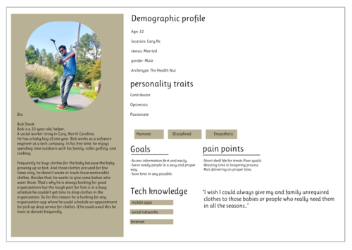
User Persona:
Bob typically knows exactly what he's looking for an organization to donate his baby clothes online. he gets frustrated when pickup or deliver descriptions are unclear or not accurate, as he needs to access information easily.
Ideate
Start With Analysis:
I began by sketching out the desktop sites of various competitors including One Warm Coat and ClothingDonation.org. With a few design patterns in mind, I sketched out multiple options for each screen in the main Over Attired user flow.
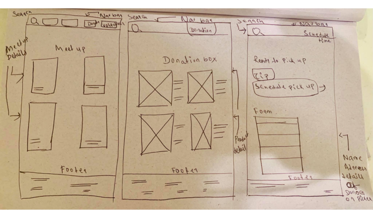
Wireframes and Concept Testing
After sketching out a few different designs for each page, I made low-fidelity wireframes and conducted some concept testing to get feedback before moving on to high-fidelity designs.
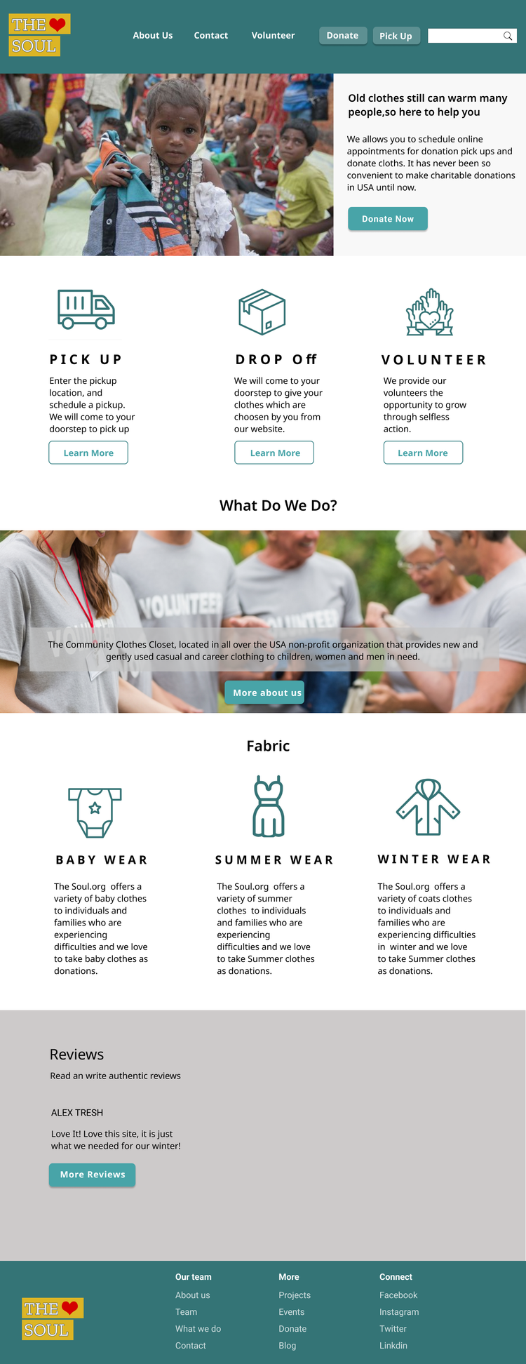
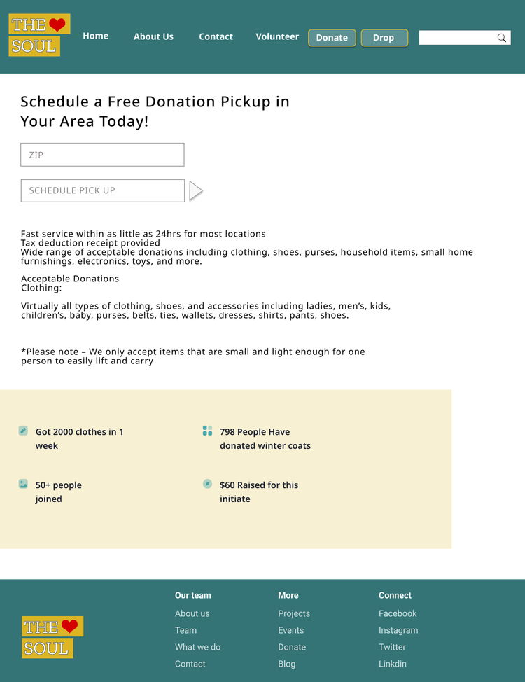
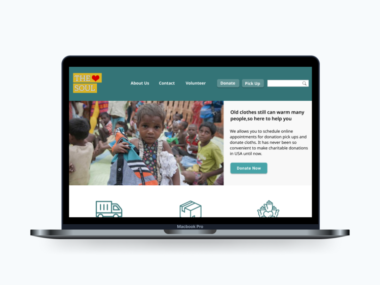
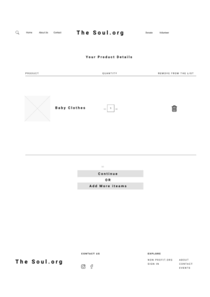
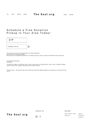
Home Page
Whatever it is, the way you tell your story online can make all the difference.
Make It Stand Out
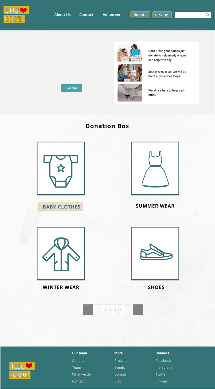
Next, I was curious if people would prefer seeing multiple smaller images on the mobile home screen, or seeing fewer large ones. People selected the multiple smaller images for easier skimming. Once they found something they liked, then they could click into that product for larger images.
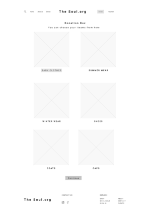
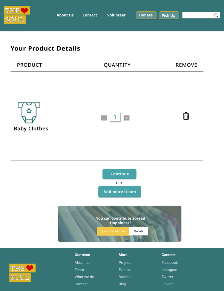
Accordions Preferred For Description Organization
The current site presents all the product information. I wanted to see if people preferred it organized into accordions, which might add a few clicks, but also reduce scrolling. Participants definitely preferred the accordions as a means of quickly finding the headings they cared about.
Whatever it is, the way you tell your story online can make all the difference.
Whatever it is, the way you tell your story online can make all the difference.
Whatever it is, the way you tell your story online can make all the difference.
Whatever it is, the way you tell your story online can make all the difference.
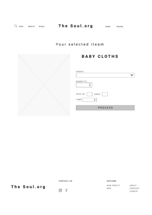
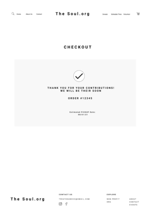
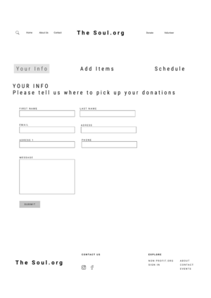
Design
With a few key concepts validated from low-fidelity testing, I moved onto high-fidelity screens. Then brought my wireframes and branding to life by creating high-fidelity mockups of the Soul homepage and various other pages. During this process, I ended up reorganizing the hierarchy of my original low-fidelity wireframe designs based on feedback from my mentor and other peers.