My Roles
User Research
User Interface Design
Timeline
4 weeks, approximately 80 hours
Background
The mirror started back in 1994 as a clothing store targeting a budget-minded audience who looked for low-cost clothing for any occasion. Their main goal is to make any type of clothing accessible to everyone. They want to expand their business horizons by having an online presence.
Mirror chose to remain brick-and-mortar until very recently when they decided to invest for the first time in online retail.
Mirror customers have long requested a website, citing the ease and convenience of online shopping, as well as issues like particular sizes, colors, and styles being sold out in-store.
In the face of the current pandemic, online shopping is more essential than ever
Goals
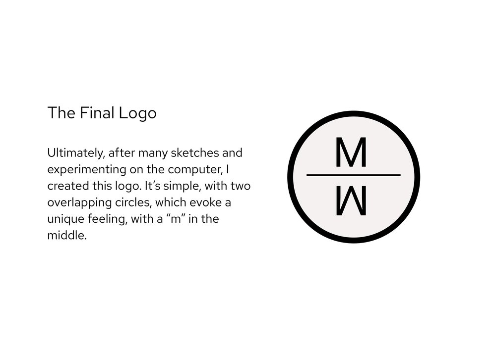
Create a new logo that fits the Mirror brand
Create a UI design for the Mirror website
Have a clear filtering system that makes sense
Create a positive user experience.
The Problem
Consumers voiced the desire for the sustainable brand, Justified, to go online as many other stores have so that they can conveniently shop from anywhere and find sizes and styles that might not be available in store.
Solution
In order to solve this problem, Justified wants to have a responsive e-commerce website and also modernize its brand and logo. The brand message they are going for is neutral, comfortable, modern, and clean.
Brand & UX/UI Development Process
Research
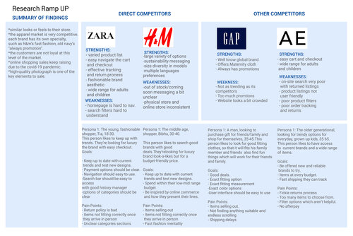
Competitor Analysis
User Interviews
Card Sorting
Persona
Research
Discovery & Immersion
Market Research & Competitive Analysis
I conducted market research to understand the industry and how competition in fashion retail works. It helped provide valuable insights into demographics and recent trends in the e-commerce apparel space. Additionally, I looked at five fast fashion brands that sell affordable clothes for both men and women. I researched both direct and indirect competitors to get a better understanding of their strengths and weaknesses and where opportunities may be for Justified.
Define
Defining the problems through developing persona of a typical user as well as breaking down project goals into different scopes
Project Goals
Developed a project goal breakdown into business goals, user goals and technical goals as well as defining the intersections of the three.
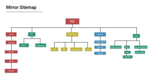
Site Map
I created the site map to visualize the information architecture and organize the page flow.
The sitemap below illustrates the overall site navigation and defines the organizational structure for the website design.
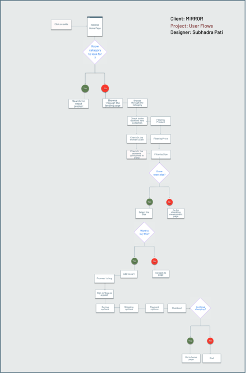
User Flow
Next, a user flow was developed. In contrast to the task flow, the user flow allows for more variance in the user’s decision making, and reflects “yes” and “no” options at different points. The result is a flow chart of sorts that demonstrates many possibilities for the user’s journey through the site
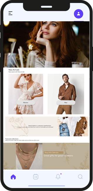
Prototype
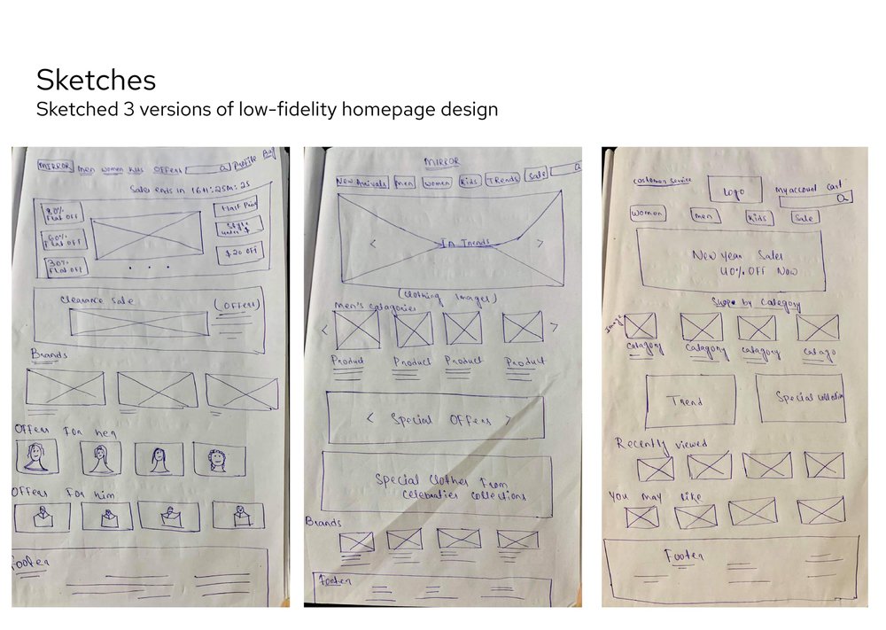
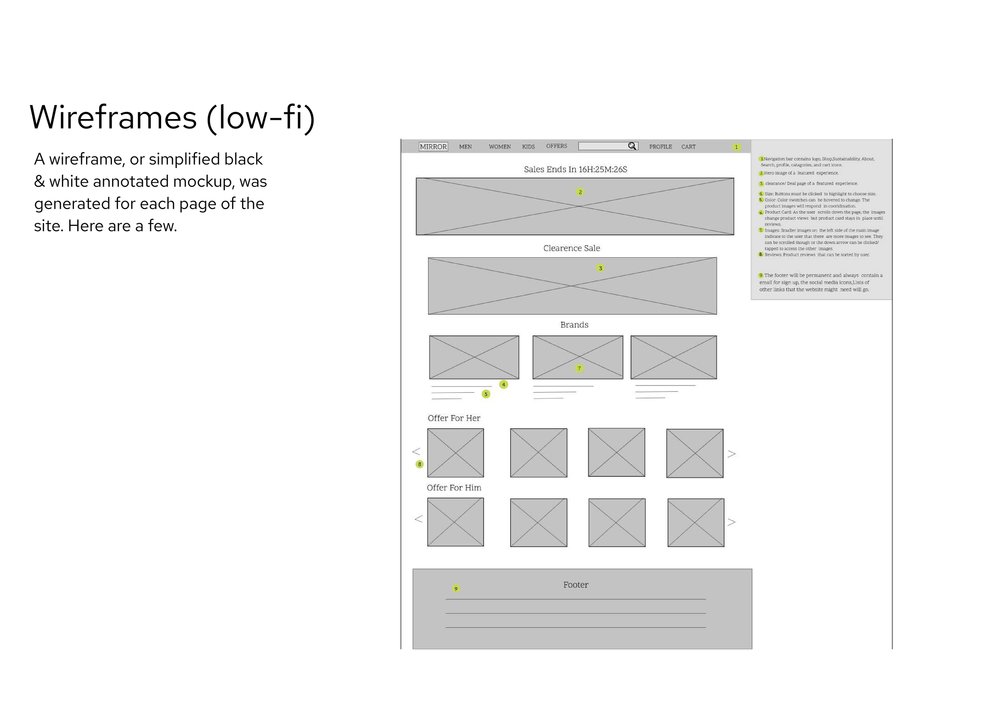
Creating design from low-fidelity to high-fidelity versions step by step based on user insights from previous phases.
.png)
One of the brief of this project was to help design a new branding to help Layers be modern and neutral. After several iterations of the logo and testing the variations of colors, we created the UI Kit.
Hi-Fi UI Design
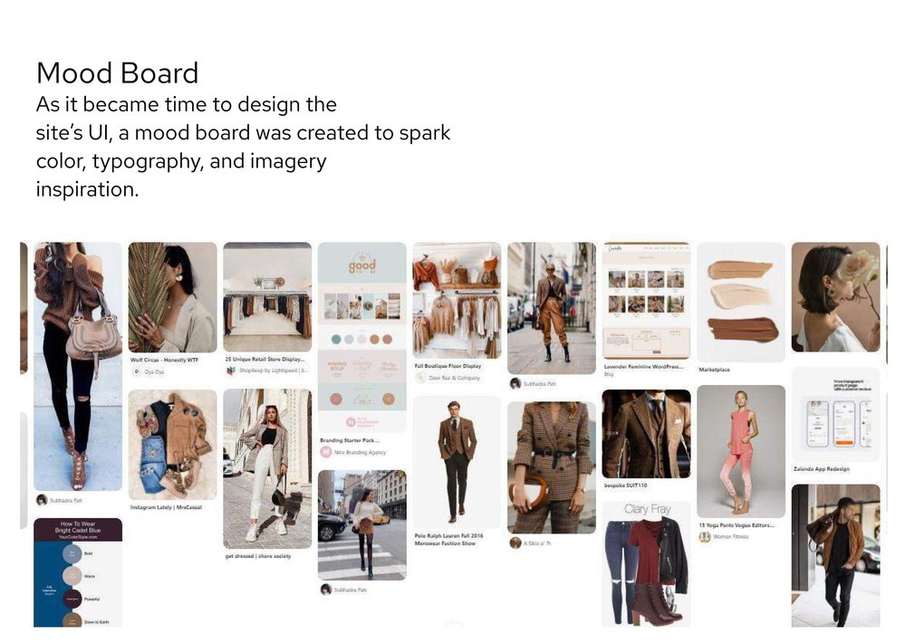
And the rubber meets the road! Using my style tile and the wireframes as a reference, I designed the homepage and plan finder page within Figma. Careful consideration was given to the use and placement of color, patterns, and photos.
.png)
Prototyping & Testing
Usability Testing:
The final static designs were turned into interactive prototypes within Figma, and then used in live usability tests, conducted remotely via Zoom & screen sharing.
Test Objectives:
1. Is the overall look and feel enjoyable and easy to navigate?
2. Can the user navigate from entrance to checkout with ease?
Test Subjects:
Four users of various backgrounds who fit the brand audience.
Close
