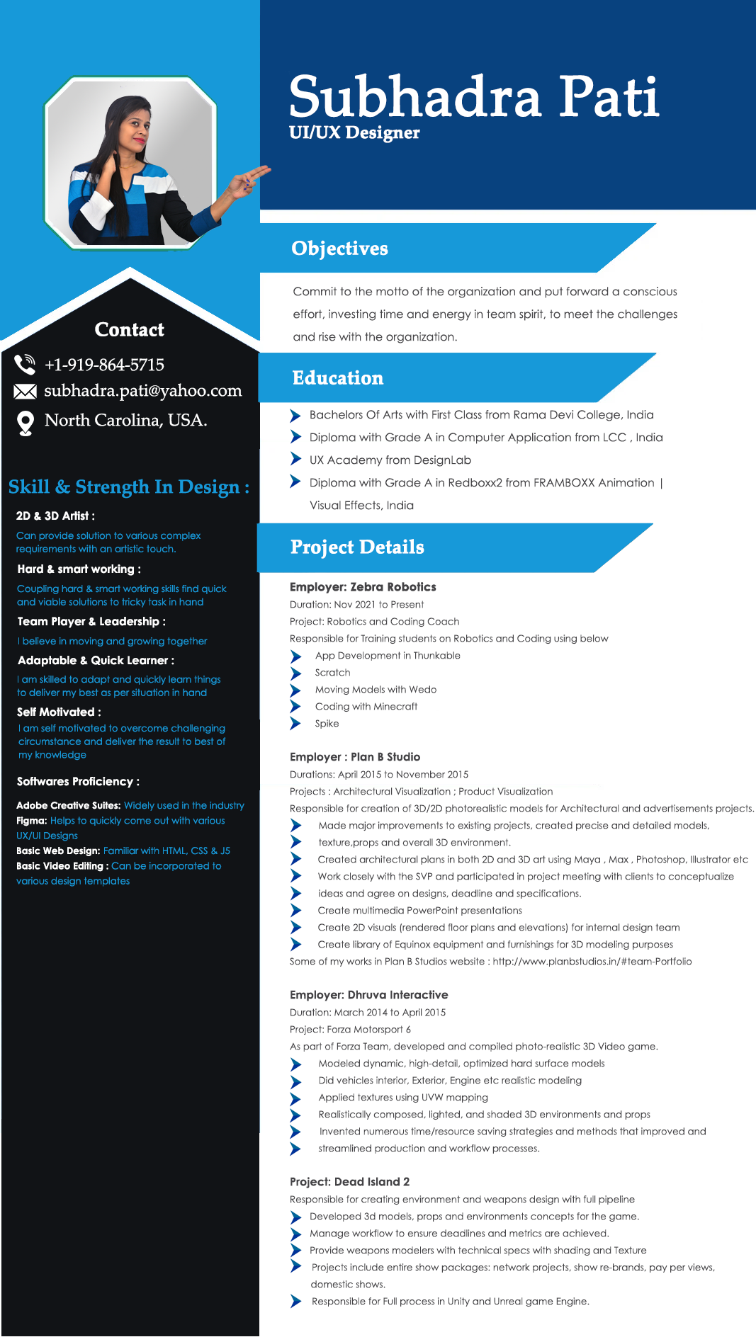
Subu’s Kitchen
Project Background
Subu’s Kitchen is a locally owned Indian food restaurant. It currently only has an online presence through social media and food delivery apps. They’re looking to add a responsive website to stay competitive with the surrounding restaurants.
High Level Design Goals and Objectives
Research real-time notifications and propose a solution on how could they be delivered to users who donʼt have the mobile app installed.
Add additional functionalities to the app, such as a frequent delivery program and other features that you find valuable to users according to your research findings.
Key Feature
The solution to providing real-time notifications installing a mobile app
Any other additional functionalities that your research proves valuable to users
The Brand Values Are As Follows:
- -Elegant
- -Playful
- -Classy
Phase 1: Discover
Research Goals
- 1.Understand people’s motivations, opinions, and expectations around using and supporting the restaurant.
- 2.Understand the circumstances that these users would use the restaurant website, and what key features they would expect.
Methodologies:
- a.Industry & competitive analysis
- b.Individual interviews
- c.Online survey
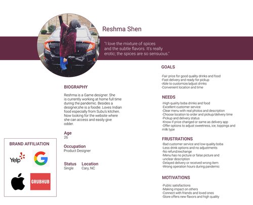
Persona
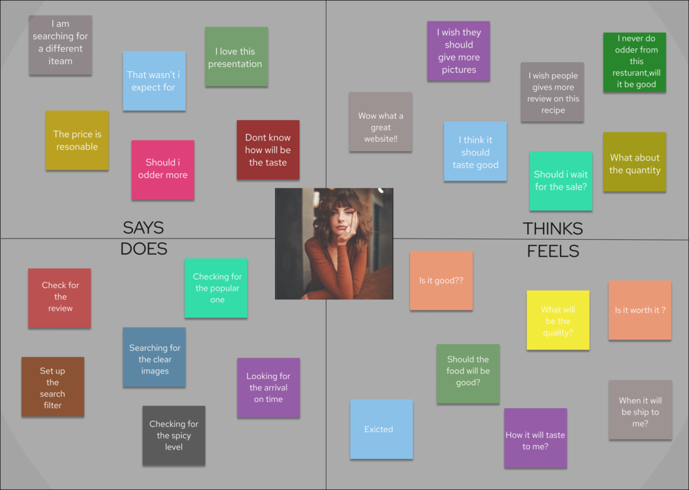
Create a user persona that covered the goals, needs, frustrations,motivations of the ideal user.
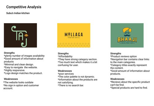
Competitive Analysis:
Whatever it is, the way you tell your story online can make all the difference.
Research Challenge:
Due to time restrictions, I was unable to secure an interview with someone who owns an LFP or someone who could be categorized as “food insecure.” I acknowledge the effect this has on developing a complete research analysis, and recognize that for this product to be designed for all users, interviews with food-insecure people are necessary
User Survey Analysis
Goals
Understand the reviews and menu on the app.
Get all the information about restaurant hygienic maintenance.
Promo code and offers.
Needs
3/10 participants need to know the exact menu
6/10 participants need photos of the food item
7/10 participants need information on the offers
8/10 participants need information on the hygiene
Frustrations
1/10 participants stated their pain point is a lack of contact pieces of information
3/10 participants stated their pain point is bad information on websites
5/10 participants stated their pain point is lack of images on websites
Motivations
2/10 participants are motivated when there is an option of chat room
1/10 participants are motivated when the food’s description with that food images and videos
3/10 participants are motivated when there is an exact time duration of food delivered with a live map
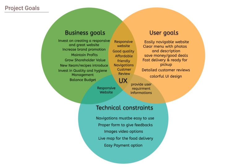
Project Goals
Competitive Analysis:
I had my user needs – and some possible solutions on how to address them. Next, I needed to orientate myself and identify business and user goals, as well as possible technical constraints. I then put these into a Venn Diagram, to identify areas of overlap and priority. I used my project brief to identify business goals and drew from my research synthesis insights for the user goals. The technical constraints were based on technical considerations – if I were working with a team to execute this website design, I would consult with the developer to identify real technical constraints.
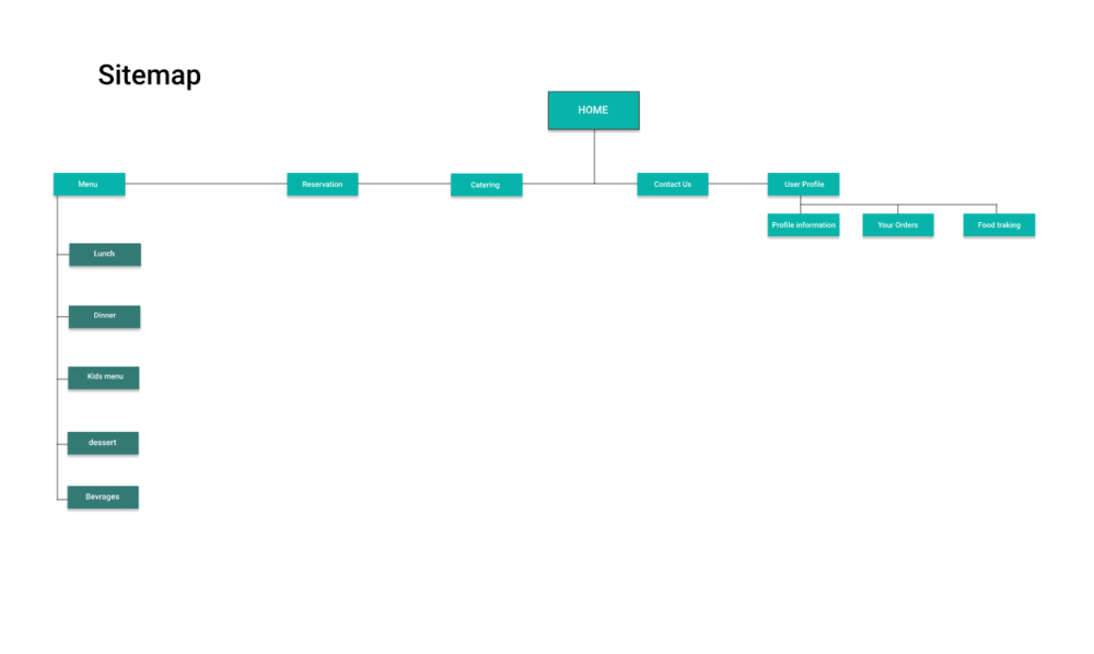
Sitemap
Additionally, to improve on the current shopping experience, I felt making enhancements based on basic usability principles would over the competition by providing the feel of a trusted established online seller. With these ideas, I was able to define what pages and features to include by creating a site map.
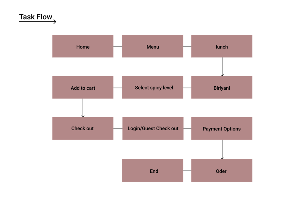
Planning For The Most Common User Path
In my final step of empathizing with the user before wireframing, I considered what the most common path might be for Rawad. It seemed like users really emphasized the speed and convenience of delivery apps, so I made sure that I modeled a flow that was simple, easy to follow through with, and unobstructed by any diverging paths or distractions. The resulting, most direct path to conversion that I came up is shown below.
Time To Design
Planning For The Most Common User Path
In my final step of empathizing with the user before wireframing, I considered what the most common path might be for Rawad. It seemed like users really emphasized the speed and convenience of delivery apps, so I made sure that I modeled a flow that was simple, easy to follow through with, and unobstructed by any diverging paths or distractions. The resulting, most direct path to conversion that I came up is shown below.
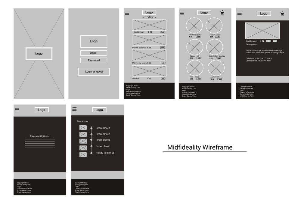
Mid Fidelity Wireframe
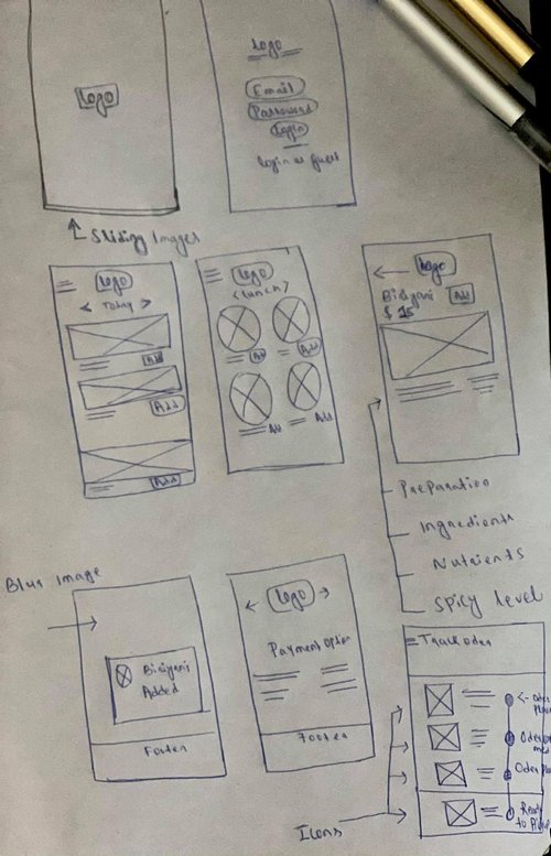
After sketching out a few different designs for each page, I made low-fidelity wireframes and conducted some concept testing to get feedback before moving on to high-fidelity designs.
I showed the following screen comparisons to some people familiar with the food apps.
User Interface Design
Mood Board
After making updates to the mid-fidelity wireframes, I was confident that the user flow, layout, and navigation were strong. From there, I needed to create a high-fidelity mockup of the final website design, including branding. To start, I created a mood board by choosing brand attributes based on user feedback and market research. These brand attributes acted as guiding principles as I gathered inspiration for the logo, color scheme, and font.
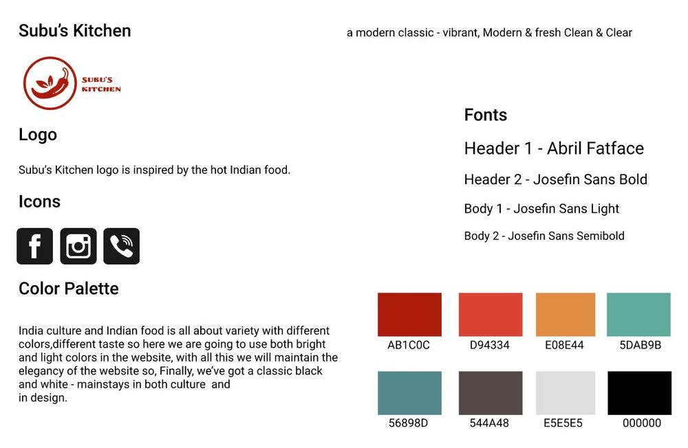
Branding
UI Kit
Because I used UI Kit in my initial mid-fidelity wireframes, I knew I needed to create my own components to have a unique yet consistent design. I applied the branding of my style tile and created my own UI Kit that would not only make it easier to implement the high fidelity wireframes but also would act as a blueprint for any further changes to the design to ensure consistency.
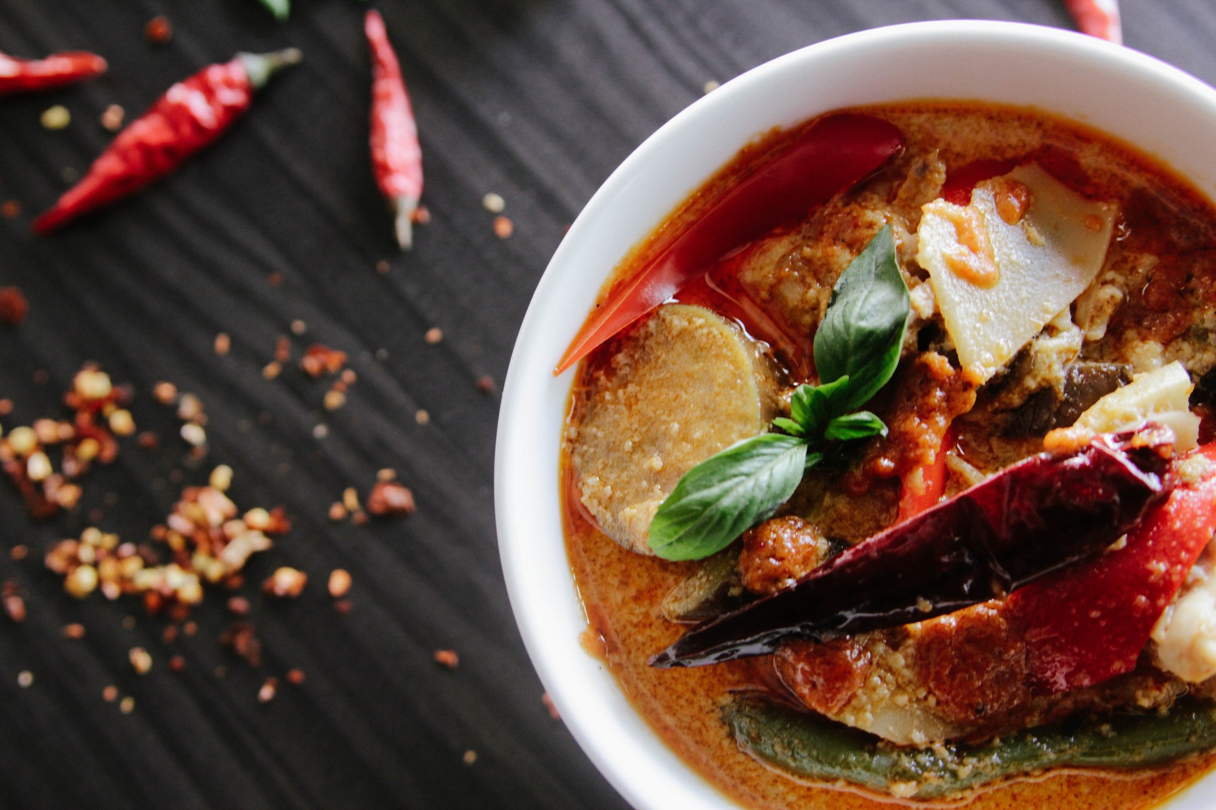
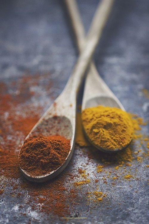
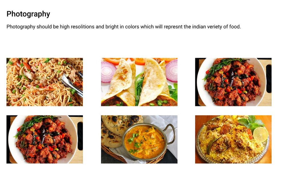
Photography
I had a specific choice for photography.
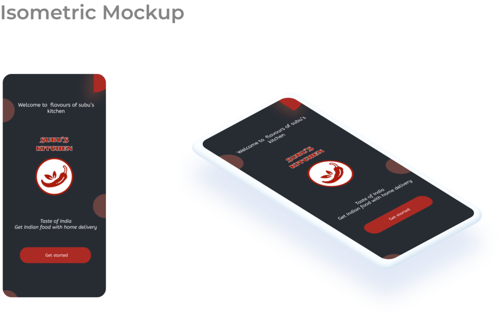
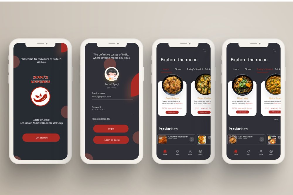
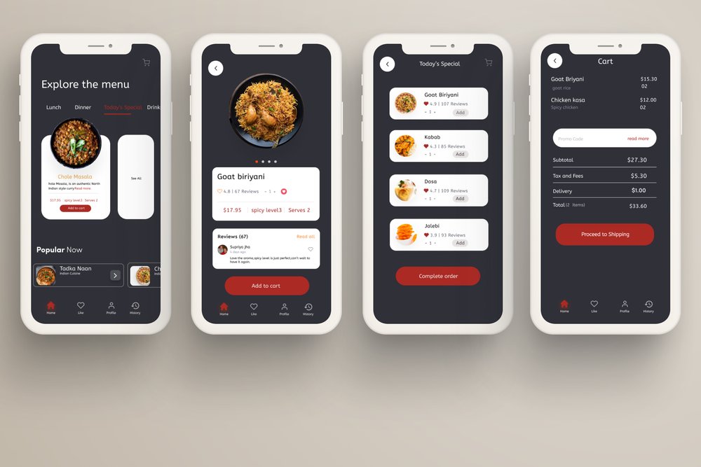
Putting All of My Designs Together
I applied my new branding to my lo-fi wireframes and did some tweaking to ensure that the result was still easy to look at, simple to navigate, and designed to give an impression of reliability. The result is shown below.
Putting It In Users’ Hands
Iteration & Implementation
After going through a few rounds of iterations on the low-fidelity wireframe, I conducted a usability test after each iteration. This was important to perform this test so I could find areas to improve on early on. Each round had 4-5 participants to determine further changes before moving to the high-fidelity wireframe.
Usability Test Planning
Reflection
Throughout the design process, I had a few setbacks during the research phase. It was challenging to narrow down the direction I wanted to go in to bring the restaurant experience home. Even though there were difficulties during the design phase, I learned that it was necessary to create an enjoyable app. If there was more time for the project, I would have loved to explore and refine features in Subu’s kitchen
Close